
You are currently browsing the category archive for the ‘Corporate Identity’ category.

Logo Sketches

Final Design
.

CI manual
.
Title / Corporate Identity Design & Manual
Client / KiwiToday Education Centre
Year / 2007
This Chubby kiwi guy is a logo and mascot for KiwiToday Education Centre; an agency that specialize in educational program of New Zealand.
We try to create an image that friendly, cheerful and attrective to kids and parents using set of bright colours and cartoon-like graphic. A collaboration with ibdz.

Page layout samples
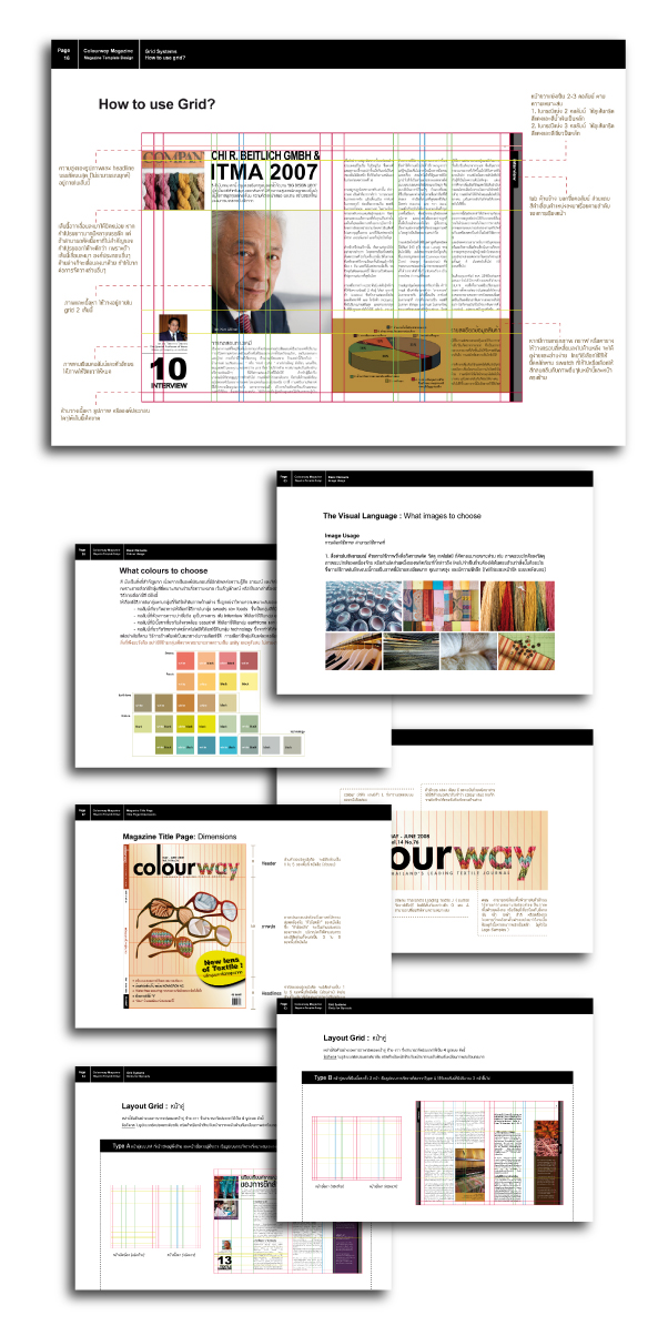
Colourway Magazine Design Manual, the guidelines on:
Colour Scheme
Visual Language
Typography
Grid Systems
Layout Composing
Basic Elements
etc.
Title / Layout Design (Guideline & Templates)
Client / Colourway, Magazine of ATDP
focusing on textile technology and textile innovation
Year / February 2008
—————————————————————————————————
Colourway is a textile magazine that has been around for almost 13 years,
we’ve been given the opportunity to do the re-imaging
of the whole magazine since the beginning of 2008.
For a while Colourway has been recognized as a serious book of
research and information written by a group of senior professors
and textile professionals.At first, the intense contents was mistaken as a problem,
but we think this fact is what makes it different than other textile magazine.
Along the working process we also found out that most of
the professors & writers of Colourway are very open,
the kind of people that wants to share good things that he/she have
to Thai textile society.
Only one problem we have here is that the old-fashion look of the book
make it even harder to understand full loads of information,
and didn’t make new readers bother to take a look at what’s good
underneath the dull cover.
After many discussions & meetings with the client,
we start to create a new context for Colourway
from a serious, intense and boring
to become a magazine that is friendly, smart and straightforward.
And the new design above comes afterwards.


Title / Authentic with nature, Corporate Identity Design
Client / Greenville Trading, silk manufacturer
Year / February 2008
We are inspired of who GV is, as a client and as an ideal corporate that care about the environment. Not only they do care, they’ve done quite something for more than 10 years.
In 2007 Greenville was certified EU Flower, becoming the first silk of the world to have this honor. (EU Flower is a European standard of factory which its production process safe to people and environment.)
This design intend to reflect the stand of GV, as a leading silk manufacturer and a nature lover. At the time it was a cocoon, it gives beautiful silk thread. When it turns into butterfly, it beautifies the world.

Title / Corporate Identity (Sketch Design)
Client / Ongartmasaree Nursery
Year / July 2008

Title / Jewel of Siam, Corporate Identity & Brochure Design
Client / Fighting Fish Shop, Personal Project
Year / 2006

Title / Everyone is Power, Logo & Namecard Design
Client / X-Glue
Year / September 2007

Title / Corporate Identity Design
Client / Apple Jewelry
Date / 2006
